
Assortment planning in Grocery & CPG: the gaps your style-level reports can't see
Style-level assortment reports hide white space and over-assortment in grocery and CPG. Here's how attribute-level data fixes the blind spot.

A category manager reviewing a yogurt reset sees forty SKUs, ranked by velocity, rolled up by brand and pack size. The report says three items should go and two should stay on the fence. What it does not say is that the entire 0% fat, high-protein, single-serve segment under 5 grams of sugar has exactly one facing, while three near-identical 2% fat cups sit two shelves away splitting the same demand three ways. That gap and that overlap are invisible at the style level. They only show up when you slice the category by attribute.
This is the quiet failure mode in most assortment work. Reports built at item or style level answer "which SKUs sell" and "which SKUs to cut." They do not answer "where does the line have nothing to offer" or "where are we stocking five variants of the same customer need." Those questions live one layer down, in the attribute columns that most category reviews never touch: fat content, protein per serving, package format, flavor family, organic status, sugar band, unit size. A style-level report aggregates across all of that. An attribute-level view is the only place the gaps and the redundancy become visible.
Why the rollup hides the structure
Assortment analysis is fundamentally a group-by operation. You pick a dimension, sum or average performance across it, and rank. The dimension chosen determines what you can see. Rank by brand and you learn which brands are winning. Rank by pack size and you learn which formats move. Rank by SKU and you learn which items to cut on trailing velocity. None of these cuts, on their own, show you the two-dimensional space of attribute combinations where real customer preference and real shelf supply either line up or don't.
Retail and CPG teams are increasingly aware of this. Modern assortment work is moving toward store-cluster and attribute-level analysis rather than blanket sales-volume rankings, because two stores with identical category sales can still serve very different underlying customer groups, and products that look weak at the aggregate can be winning in specific segments the aggregate averages away, according to Impact Analytics. The same logic applies inside a single store's assortment. A category that looks fully covered on paper can still have segments with real, provable demand and zero facings, because nobody cut the data along the attribute that actually organizes how shoppers choose.
Three things a style-level report can't show you
White space. A combination of attribute values, say organic plus single-serve plus low-sugar, where market or loyalty data shows real demand but the current line offers zero SKUs. This is different from "we don't sell much of this" — it's "we sell none of this and shoppers are buying it somewhere else." A brand or retailer only sees this if attribute values are complete and standardized enough to build the grid in the first place.
Over-assortment. Multiple SKUs clustered in the same attribute cell, cannibalizing each other's velocity rather than expanding total category demand. This shows up as three "distinct" items that are actually near-substitutes once you strip marketing language and look at the underlying spec: same fat content, same size, same flavor family, different label. Style-level reports treat these as three separate line items with three separate trend lines. An attribute grid shows them piled on top of each other.
Break points. The threshold where a shopper's preference flips from one attribute value to an adjacent one, and where the line has a gap right at that seam. A common one in dairy and snacks is the sugar-per-serving threshold that separates "treat" from "everyday" purchase occasions. If the assortment jumps from 2 grams to 14 grams of sugar with nothing in between, that's not a range, it's a hole exactly where a chunk of the category's shoppers actually sit.
None of these three show up in a report grouped by brand, SKU, or even category. They only show up when the attribute is the axis.
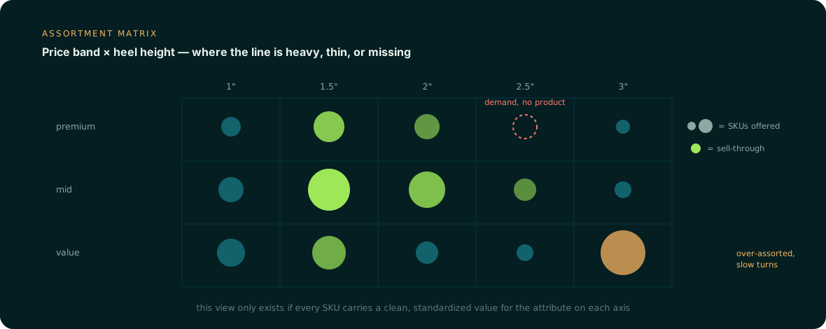
Walking one example: Greek yogurt, cup format
Picture a mid-size dairy brand reviewing its Greek yogurt cup line ahead of a spring reset. The starting point is a single clean attribute column, per SKU, for fat content, protein per serving, sugar per serving, size, and flavor family. Pulling that column against category sell-through and building a grid produces:
| Fat content | Sugar band | SKUs offered | Sell-through | Read |
|---|---|---|---|---|
| 2% | 8-10g | 3 | Mixed, cannibalizing | Over-assorted |
| 0%/nonfat | 8-10g | 2 | Strong | Adequate |
| 0%/nonfat | 0-4g, high protein | 0 | N/A (whitespace) | Gap — add |
| Whole milk | 8-10g | 1 | Strong, no substitutes nearby | Protect |
The decision that falls out is not "cut the weakest SKU," it's "collapse two of the three 2%/8-10g cups into one, and use the freed facing to launch a 0%/high-protein/low-sugar item that the grid shows has no representation at all." That is a line decision a style-level velocity report cannot produce, because velocity alone can't distinguish "this SKU underperforms because it's weak" from "this SKU underperforms because it's the third copy of the same thing."
What has to be true of the data first
This kind of grid is only as good as three properties of the attribute data underneath it, and grocery and CPG catalogs routinely fail all three.
Fill: every SKU needs every relevant attribute populated. A protein value missing on 15% of the yogurt set means 15% of the grid is unclassifiable, which quietly understates whichever cell those SKUs would have landed in.
Standardization: "0% fat," "nonfat," "fat free," and "0g fat" have to resolve to one value, or the grid splits a single segment into four sparse ones and manufactures false white space.
Correctness: values pulled from legacy ERP fields or old spec sheets drift from what's on the actual label or pack. A sugar value that's wrong by a few grams can put a SKU in the wrong band and hide the exact break point you're trying to find.
Getting to that state usually means going back to the source signals, spec sheets, nutrition panels, tech packs, package imagery, and reviews, rather than trusting whatever free-text description has been copied forward for years, then validating and standardizing values against a controlled attribute taxonomy before anything gets aggregated.
This is the layer Anglera works on. Your PIM or planning system stores the attribute values; Anglera extracts them from source documents and imagery, normalizes them to a consistent taxonomy, flags conflicts instead of silently picking one, and fills the gaps so the grid above is trustworthy before a single line decision gets made. Better forecasts and sharper assortment calls don't start with a smarter model. They start with an attribute column you can actually group by.