
The one-day attribute audit before you trust any planning report
A one-day audit for fill rate, cardinality, consistency, and staleness before you trust any attribute-driven forecast or assortment report.

A planner opens Monday's assortment report and sees demand for "moisture-wicking" tees running 22 percent below plan. Before anyone reacts, someone should ask a duller question first: how many SKUs in that rollup actually have a populated, correctly-tagged fabric attribute, and how many are hiding under "N/A," a typo, or a value nobody's touched since a 2022 catalog migration? Most planning teams never ask. They build the report, trust the axis, and move on. That's how a data problem becomes a business decision.
The fix isn't a data governance program. It's a one-day audit, run before you build (or re-trust) any planning report that aggregates by attribute — color family, fabric, fit, category tree, size curve, whatever dimension the model slices on. Master data management exists precisely because flawed master data misleads analytics — the classic example is a system that reads "Rice 50kg," "50kg Rice," and "Rce 50kg" as three different items and quietly understates real demand for all of them. Attribute fields have the same failure mode, just less visible because nobody eyeballs them SKU by SKU.
Why "mostly complete" isn't the bar
The instinct is to check fill rate and stop there. That's the trap. A field can be 98 percent populated and still be useless for forecasting if a third of those populated values are wrong, stale, or defined three different ways across categories. Data quality frameworks generally separate completeness from accuracy for exactly this reason — they measure different failure modes, and a report can pass one while failing the other completely.
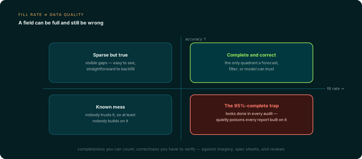
The bottom-right quadrant is where most retail and distribution catalogs actually live: fields that look done in a completeness dashboard because someone bulk-filled a default value, a copy-paste from a similar SKU, or a legacy code nobody remapped. High fill rate, low accuracy. It passes every audit that only checks for blanks.
Five checks, one day
None of these require a data science team. They require someone willing to pull a sample, run a pivot table, and look at pictures next to text for twenty minutes. Here's the sequence, in the order that catches the most damage first.
| Check | What it catches | How to run it |
|---|---|---|
| Fill rate by category and season-cohort | Blind spots that hide inside a healthy overall average — new categories, discontinued seasons, recently onboarded vendors | Pivot fill percentage by category and by launch season, not just overall; a 92 percent global fill rate can mask a 40 percent fill rate in this season's new-vendor SKUs |
| Value cardinality | Free-text explosion — "Navy," "navy blue," "NVY," "Navy/Blk" all meaning one color | Count distinct values per attribute; if a bounded field like color or fit has hundreds of unique strings for what should be a controlled list of 20-30, it's not usable as a grouping key |
| Cross-source consistency | Text that contradicts the product itself | Sample 30-50 SKUs, pull the primary image or tech pack, and check whether the attribute value matches what's actually shown — sleeve length, closure type, material, silhouette |
| Staleness | Values frozen at first entry and never revisited as the product or its data source changed | Check the last-modified timestamp on the attribute field, not the record; a SKU touched last week for a price change can still carry an attribute value nobody has reviewed in three years |
| Definition drift across categories | The same attribute name meaning different things in different category trees, corrupting any cross-category rollup | Pull the attribute's allowed values or format for each category branch and diff them; "sleeve length" measured in inches in one taxonomy branch and as a size code in another will break any forecast that sums across both |
Cardinality is the one planners underestimate most. A model treats every distinct string as a separate bucket unless something normalizes it first, so 40 spellings of the same color don't dilute the "navy" signal, they erase it — the demand history splits 40 ways and every bucket looks thin. The forecast doesn't fail loudly. It just quietly under-forecasts the color that actually sells.
Where the line is
Not every gap needs a project. The judgment call is whether an attribute is safe to aggregate on as-is, or needs enrichment before it goes near a planning model.
| Signal | Safe to aggregate | Enrich first |
|---|---|---|
| Fill rate (worst cohort, not average) | Above roughly 90 percent in every category-season slice you plan to report on | Any slice materially below that, especially new launches or recent vendor additions |
| Cardinality vs. expected value set | Distinct values within roughly 1.5x the controlled list size | Distinct values several multiples of the controlled list — a sign of free text standing in for a dropdown |
| Cross-source match rate on sample | 90 percent-plus of sampled SKUs match imagery/spec | Meaningful mismatch on a 30-50 SKU sample, which almost always generalizes |
| Staleness | Attribute touched within the last major catalog or PIM sync | Last touched before a system migration, vendor change, or category rename |
| Definition consistency | Same field, same format, same allowed values across every category branch in the rollup | Field means different things (units, granularity) depending on category |
If two or more of these fail on the attribute your forecast leans on hardest, that's not a report to ship yet. It's a backfill project, and a bounded one — a single attribute across an existing catalog is a matter of days, not a quarter, once the source documents and images already exist to extract from.
Making the audit continuous
The honest problem with a one-day audit is that it's a snapshot. New SKUs onboard, vendors send inconsistent spec sheets, someone bulk-edits a field in the PIM without checking format, and the catalog drifts again within a quarter. Running this manually as an annual project means planning teams spend eleven months trusting numbers built on data nobody's re-checked since January.
This is the part that should be automated rather than calendared. Anglera sits on top of whatever PIM, MDM, or flat-file catalog a retailer or distributor already runs and continuously extracts, normalizes, and quality-scores attributes against the source documents, images, and reviews behind them — flagging conflicts instead of silently overwriting, and surfacing fill rate, cardinality, and staleness by category as an ongoing signal rather than a once-a-year fire drill. Your PIM still stores the data. The audit just never has to wait for someone to remember to run it.