
Finding assortment white space with attribute-level demand
Style-color sell-through reports average away the demand breaks that matter. Here's how attribute-level aggregation finds real assortment white space.

A style-color sell-through report will tell you the boot sold well. It will not tell you that every unit sold was under 9 inches of shaft height and the tall version has been marking down for two seasons. That distinction lives one level below where most planning reviews stop looking, and it's the level where the actual assortment decision gets made.
The report that hides the pattern
Most line reviews aggregate at style, then style-color, sometimes style-color-size. That's the grain vendors like o9 Solutions and Impact Analytics build size curves on, and it's the right grain for allocation math. Nike's own approach, as Impact Analytics describes it, forecasts at style-color first and disaggregates down to size using historical share — if a size carried 10% of volume, it gets 10% of the buy. That works because size is a clean, always-populated attribute. Every SKU has one.
The trouble starts with the attributes that aren't size and aren't always populated: shaft height, heel height, sleeve length, closure type, cushioning level, fabric weight. These are the dimensions that actually differentiate why a customer picked one style over another, and in most PIMs they're a free-text field, a spec-sheet PDF, or blank.
When you aggregate sell-through at style-color, every shaft height variant inside a style gets averaged together. A style with three shaft heights and wildly different performance per height reports as one "average" number. Average away enough real variation and you get a report that says the category is healthy while a third of its shelf space is quietly deadweight.
What changes when you regrind at the attribute level
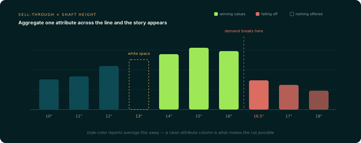
Take a boot category and re-aggregate sell-through not by style-color but by shaft height, holding everything else constant. Instead of one blended sell-through curve, you get a step function:
- Ankle to mid-shaft (roughly 5-9 inches, per the range JJ Footwear uses to define the category) sells through at a healthy clip across price points.
- There's a sharp break somewhere around 9-10 inches. Below the break, demand is strong. Above it, sell-through drops off a cliff, not gradually — a break, not a slope.
- A band above the break — call it 11 to 13 inches — still has search and browse traffic (people are looking) but almost no SKUs offered at accessible price points. That's unserved demand, not absent demand.
- One specific cell — say, 13-15 inch shaft height at a mid-price tier — is heavily assorted with a dozen SKUs, and every one of them is turning slower than the category average.
None of that is visible in a style-color report. It only shows up when shaft height is a clean, structured attribute you can group by, independent of style name or color name.
From curve to matrix to decision
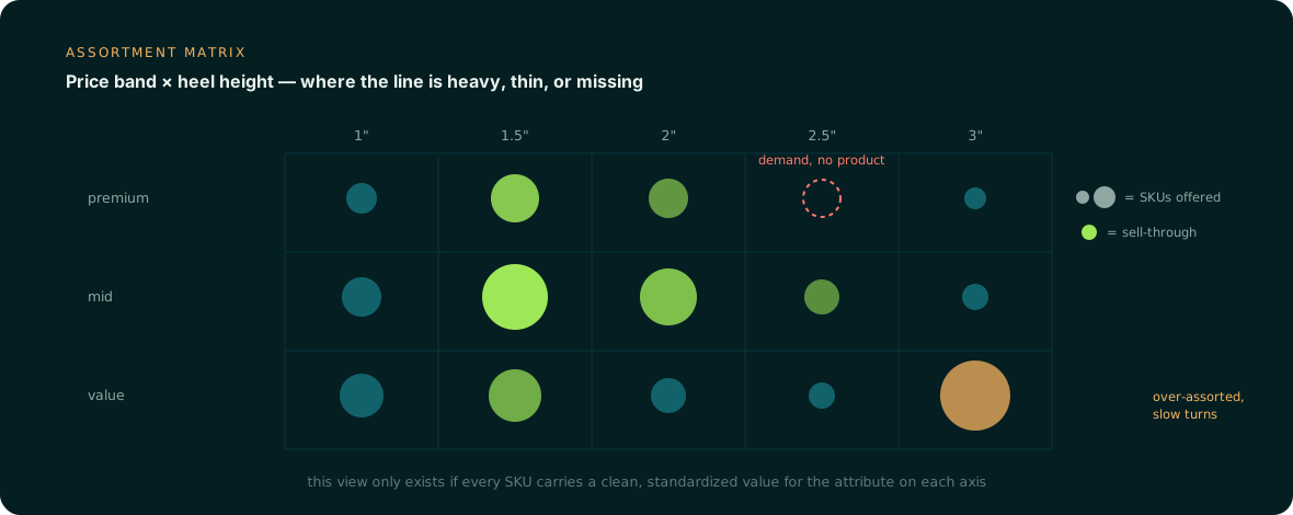
The curve tells you where the break is. The next step is to cross that attribute against a second dimension, usually price band, to see where assortment depth and demand actually overlap.
| Shaft height band | SKUs offered | Sell-through | Read |
|---|---|---|---|
| 5-8 in (ankle/mid) | 22 | Strong across price bands | Right-sized |
| 9-10 in (break point) | 14 | Steep drop above 9.5 in | Trim above break |
| 11-13 in, low-mid price | 3 | High for the few SKUs offered | Under-assorted — white space |
| 13-15 in, mid price | 11 | Weak, slow-turning | Over-assorted — cut candidates |
That's the shape a whitespace review is supposed to surface — a gap the assortment doesn't serve, a tier with no viable option, sitting next to a cell that's overbuilt for the demand it gets. Profitmind's framing of whitespace as "a price tier with no viable options" or "a format or size range that competitors carry and you don't" describes exactly this pattern, just usually applied across price and format rather than down inside a single attribute like shaft height. The matrix view makes both problems visible on one page: cut the overbuilt cell, fund a low-price SKU in the underserved band, and stop treating the whole shaft-height range as one undifferentiated line.
Why this breaks the moment the attribute is dirty
This entire analysis depends on one thing: shaft height (or heel height, or whatever attribute is driving the differentiation) being a structured, standardized value on every SKU — not "tall," not "9in approx," not a blank cell because the tech pack never made it into the PIM.
In practice, apparel and footwear catalogs are inconsistent about exactly these secondary dimensions. Size and color get entered because the ERP requires them for a SKU to exist. Shaft height, heel height, and similar spec attributes often live in a PDF spec sheet, a supplier tech pack, or a merchandiser's memory — not in a queryable field. When a third of SKUs are missing the attribute, one of two things happens to the analysis: those SKUs get silently dropped from the grouping (understating both the winning band and the white space), or they get bucketed into an "unknown" catch-all that's now large enough to mask the pattern by itself. Either way, the break point blurs, the empty band looks smaller than it is, and the over-assorted cell doesn't look as bad as it actually performs. The planner reviewing the report never sees the decision that was sitting right there in the data.
This is the case for treating attribute completeness as a planning input, not just a merchandising nicety. Anglera's PIM stores the data — Anglera reads the tech packs, spec sheets, and imagery behind each SKU and fills in the structured attribute values (shaft height, heel height, and the rest) that these curves and matrices depend on, flagging conflicts rather than guessing past them. A demand curve is only as sharp as the attribute column underneath it, and most catalogs have never had that column complete.
Sources: